Challenge: Scott Furman, with over 40 years experience, had a lot to say but needed the perfect way to say it. As a top Realtor for Philadelphia's Main Line, he wanted a unique brand identity with a big personality. Expertise and credibility were key, along with a warmth and friendliness that could speak to the hearts (and homes) of his clients.
Solution: Scott Furman Realty Group. Real Experience, Real Results.
A thoughtfully composed identity system combining distinctive visuals, effective communication and a professional but sometimes lighthearted sensibility.
A thoughtfully composed identity system combining distinctive visuals, effective communication and a professional but sometimes lighthearted sensibility.
BRAND GUIDELINES
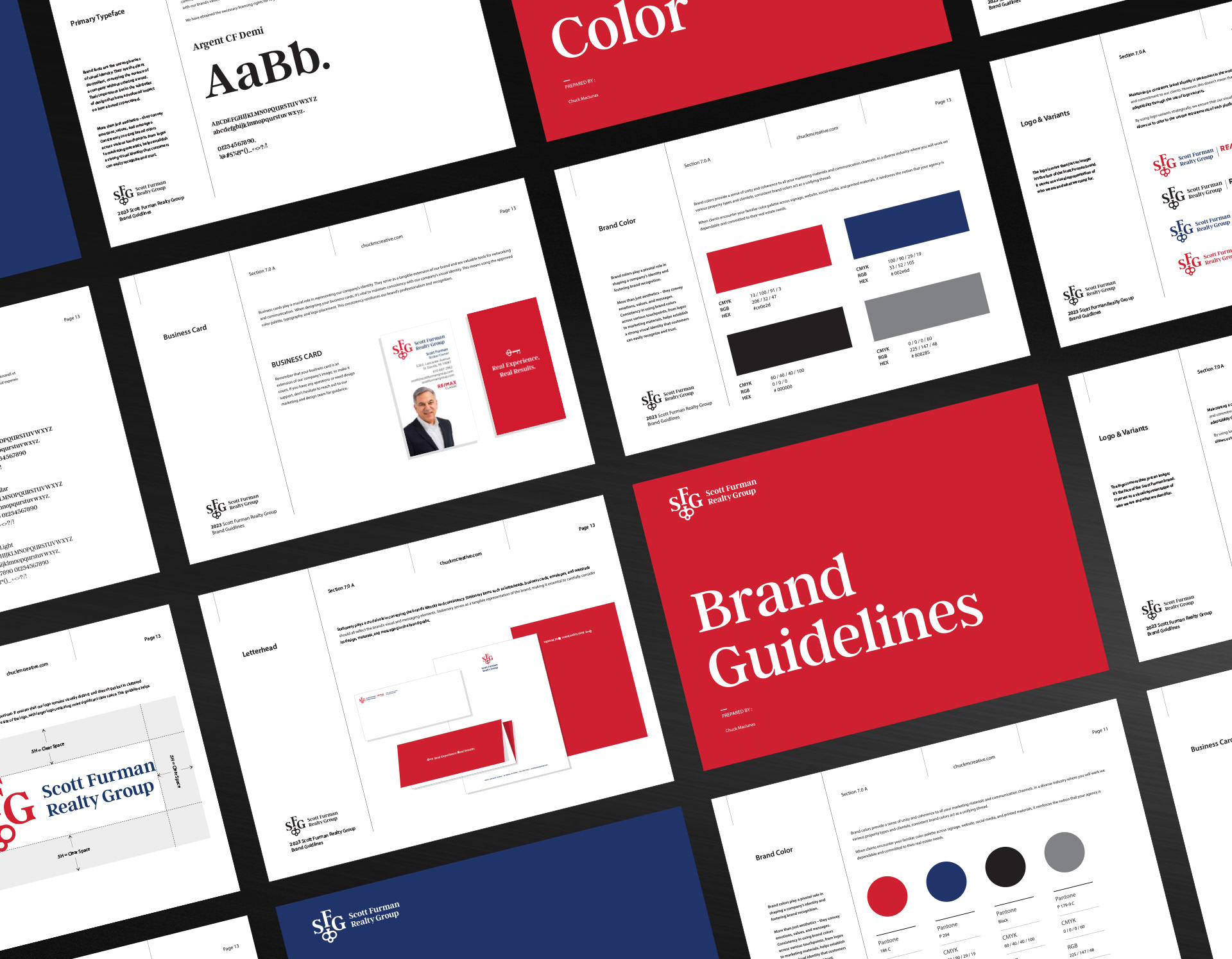
LOGO
Of three logos I created and submitted to Scott and his team, this was the favorite. Refined, unique, and clever. The 'SFG' is designed to work within the lock-up or as a standalone monogram.

I composed a brief animation to illustrate the logo's flexibility, highlighting how the key-shaped 'F' can be used to emphasize essential information.

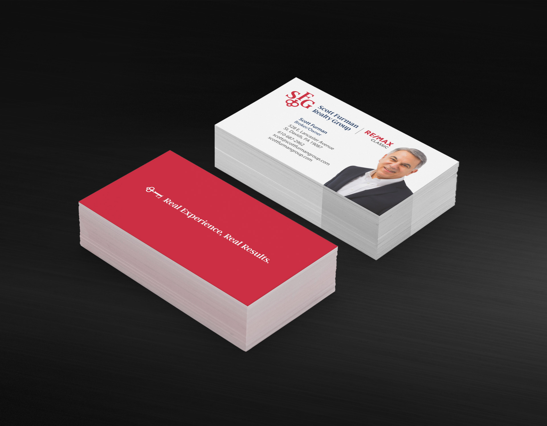
BUSINESS CARD
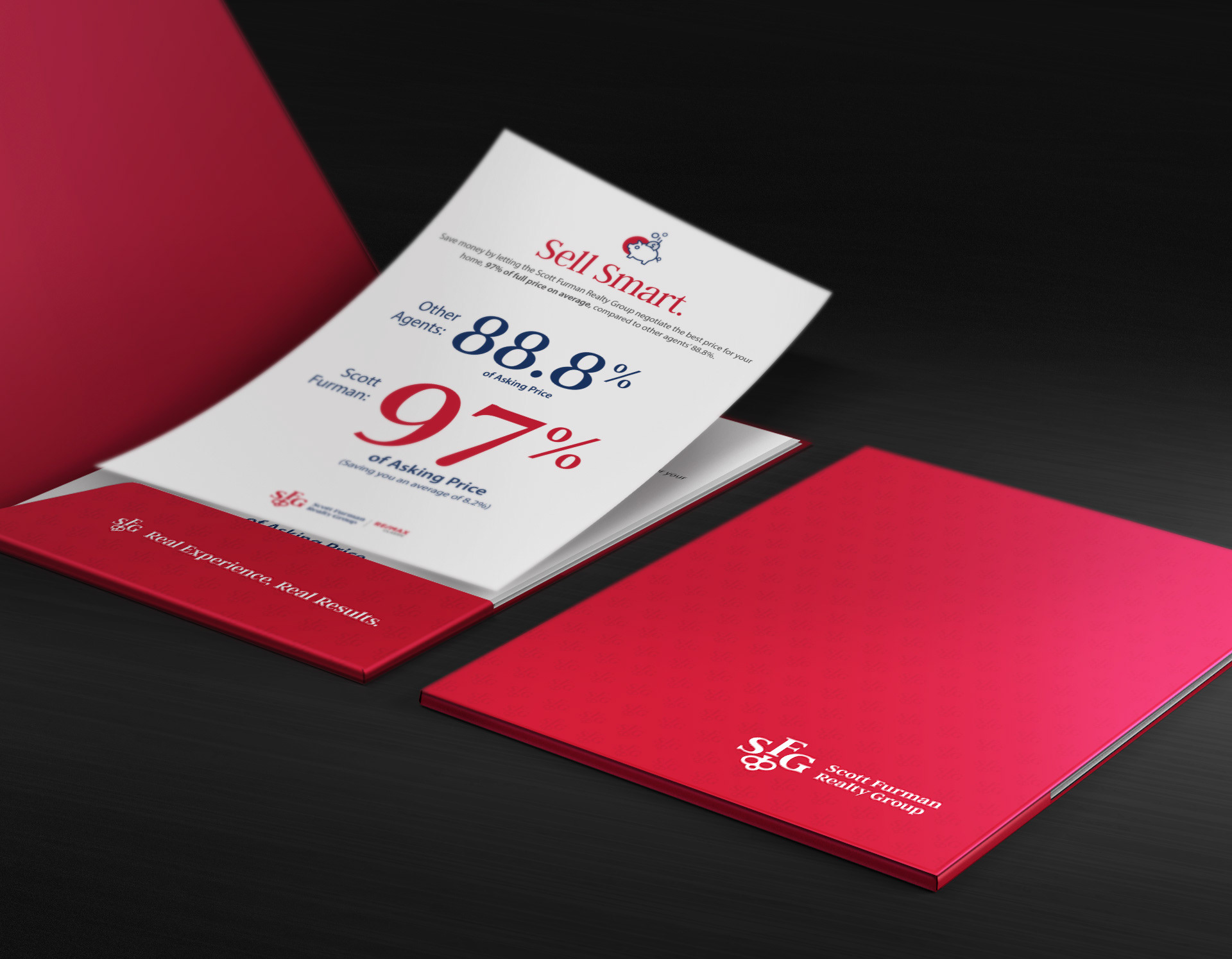
COLLATERAL PACKAGE; FOLDER AND CONTENTS
I revamped Scott's client collateral to achieve a cohesive branded look, including a custom die-cut folder printed with an elegant spot UV coating.
ICONS

WEBSITE DESIGN

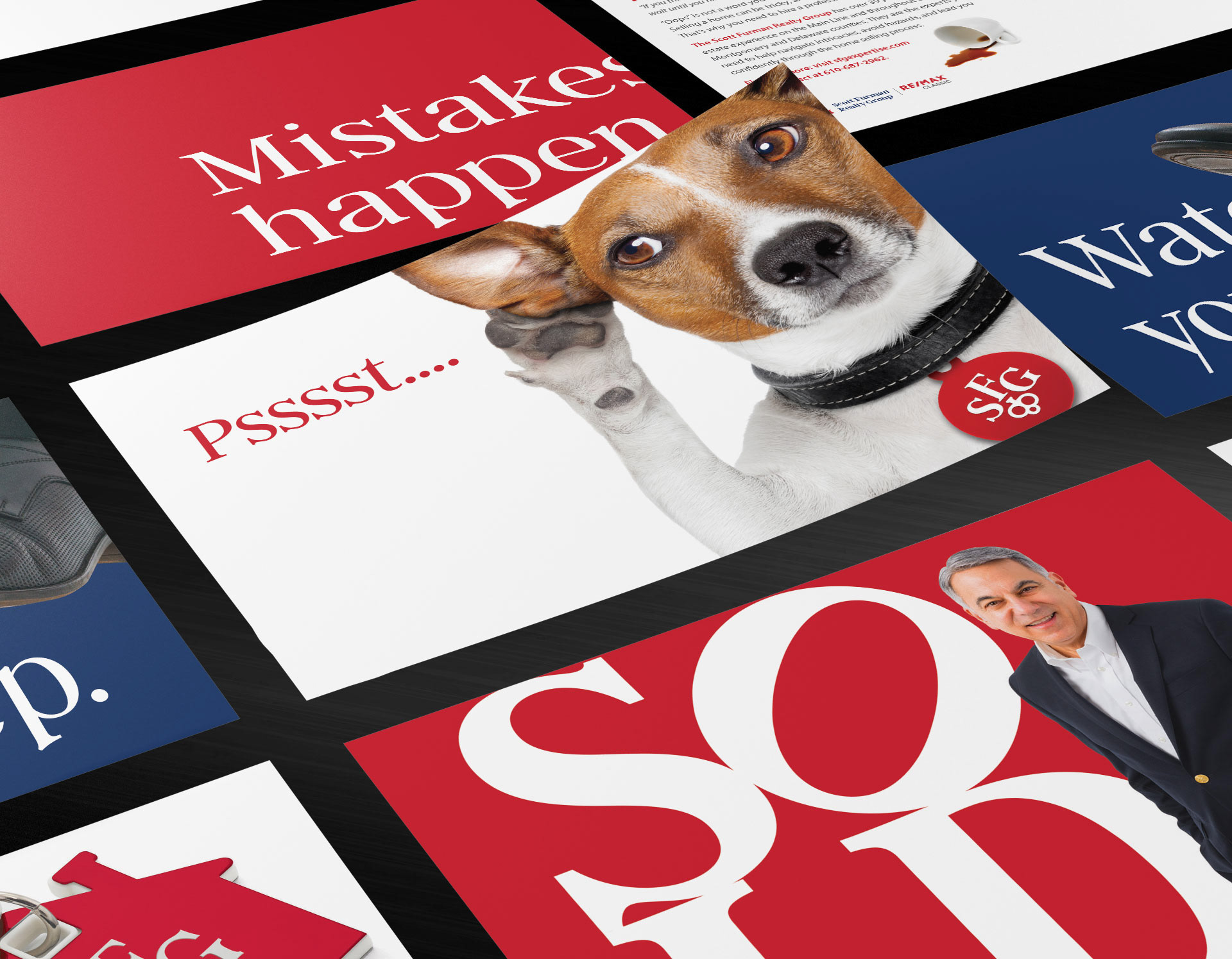
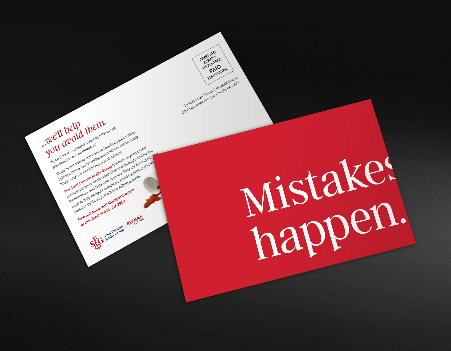
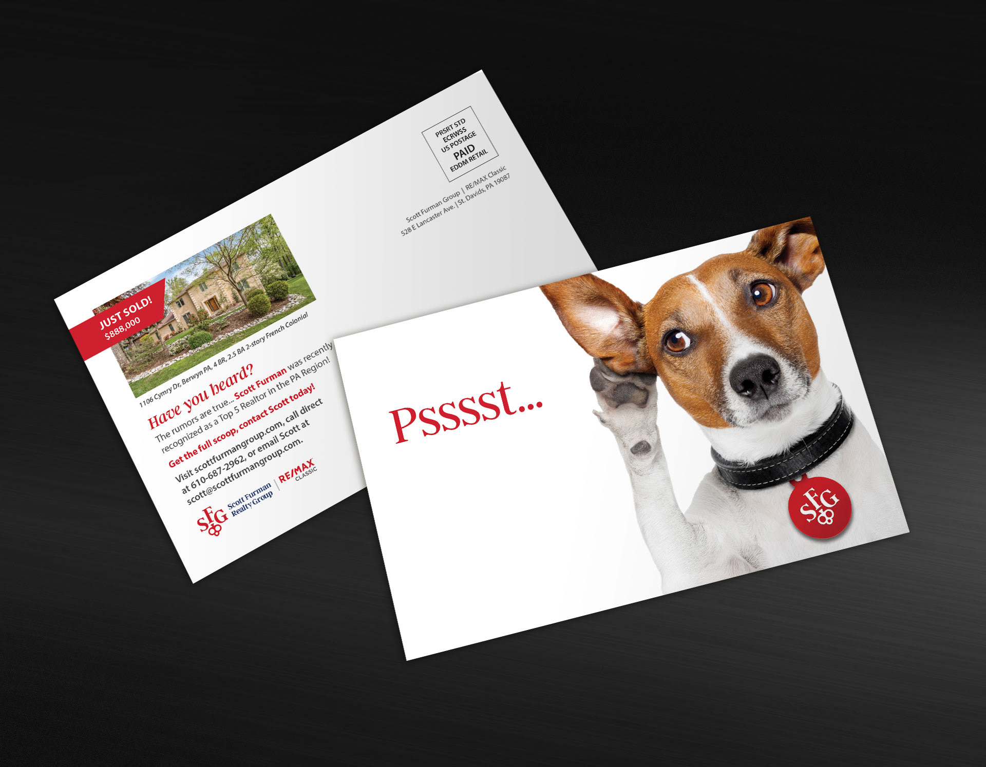
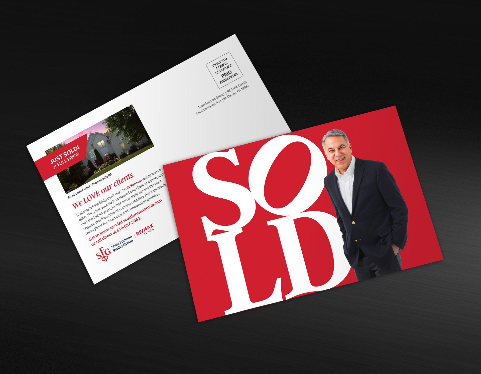
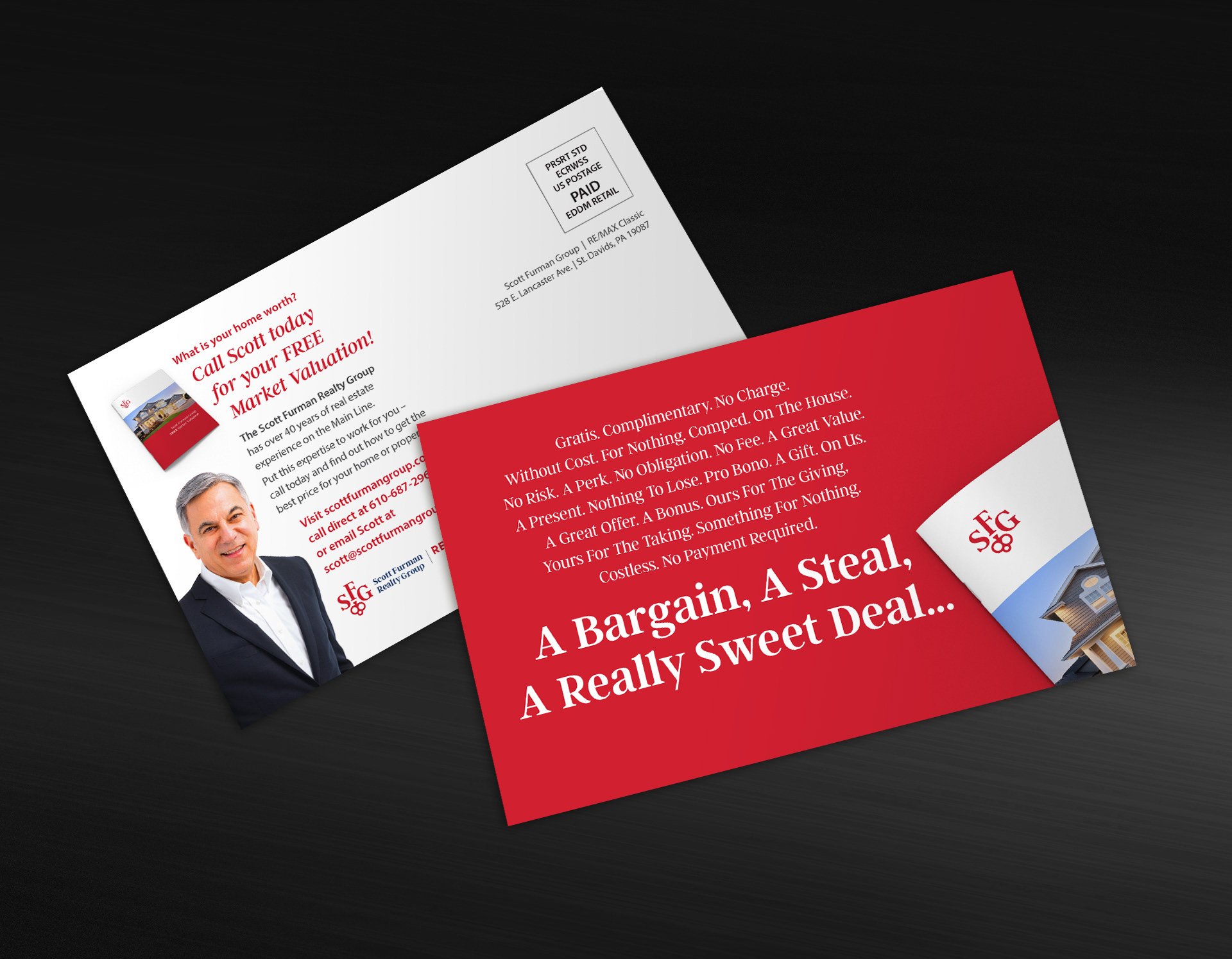
MULTI-CONCEPT DIRECT MAIL CAMPAIGN
Old dog, new tricks. An age-old marketing technique given a creative, budget-friendly boost. Direct mail cards strategically designed to stand out in a crowded mailbox and effectively deliver key messaging.
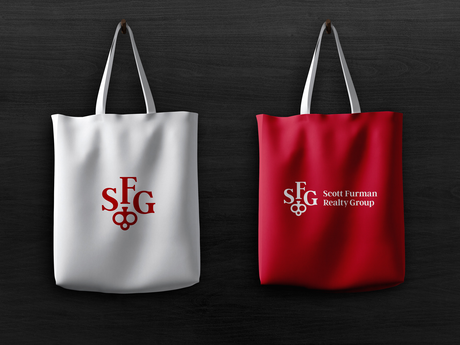
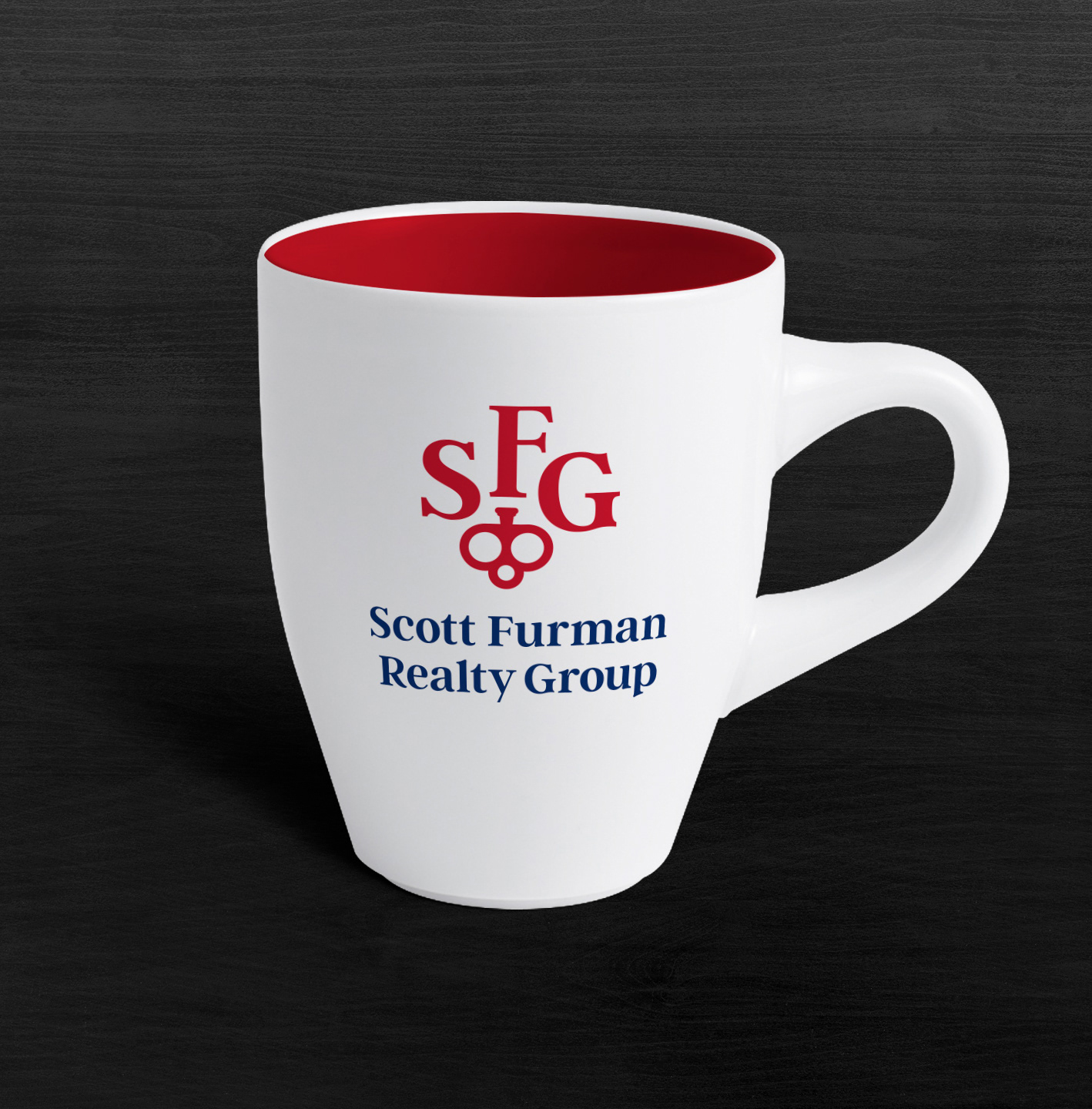
SWAG
Not just Stuff We All Get, but Stuff We All Want.